Every logo I draw spends its first three days in pure black. No gradients, no brand palette, no soft gray helper lines left on by accident. Just a solid black shape on a white page, the way a rubber stamp or a newspaper ad from 1955 would print it. Clients sometimes open my first round of sketches and ask, a little nervously, whether I forgot the color. I didn’t forget. I’m saving it, because color is the last decision, not the first.
Color can hide a weak shape. Black can’t. A bright orange circle with a soft shadow looks friendly and finished on a laptop screen, but print it in one ink on a paper cup and it may turn into a blob nobody remembers. When I work in black, there is nowhere for a lazy idea to hide. Either the silhouette says something, or it doesn’t, and I find out on day one instead of after the client has printed five hundred business cards.
Shape before color
The rule I give myself is simple. If the mark is recognizable as a black stamp, it will survive embroidery, faxes and tiny phone icons. Those three are my stress tests, and they come up far more often than people expect.
Embroidery is the toughest. A stitched logo on a polo shirt or a baseball cap loses fine lines, thin serifs and anything smaller than about a quarter of an inch. Faxes sound old-fashioned, but plenty of medical offices, law firms and county agencies in the US still send them every day, and a fax turns everything into hard black and white. Phone icons are the modern version of the same problem: your logo shrinks to the size of a fingernail and sits next to forty other apps.
A shape that works in solid black passes all three. A shape that only works in color usually fails at least one.

The squint test
Once I have a handful of black sketches, I tape them to the wall across my studio and walk to the far end of the room. Then I squint. Whatever still reads as a distinct shape stays. Whatever melts into a gray smudge goes in the recycling. It is the least scientific method in my whole process, and also one of the most reliable.
I also shrink every candidate down to 16 pixels wide, the size of a browser tab icon. If I can still tell the mark apart from a generic circle or square at that size, it earns a place in the client presentation.
Good marks are good silhouettes.
Maya
What black reveals that color hides
Working in black has taught me to notice small problems early. Here are the ones I catch most often in the first three days:
- Uneven weight. One side of a letter looks heavier than the other once the color stops distracting the eye.
- Accidental shapes. Negative space between two letters suddenly forms an arrow, a face or something less polite.
- Too many details. Little leaves, sparkles and outlines that looked charming in color turn into noise in solid black.
- Weak contrast with the name. The symbol and the wordmark fight each other instead of feeling like one family.
- Thin lines that vanish. Anything thinner than a hairline at business-card size disappears when printed in one ink.
None of these problems are visible when a designer jumps straight to a full-color mockup on a beautiful photo background. The mockup flatters the work. Black tells the truth.
How the black-first process runs
On Fiverr, most of my buyers choose a package with three days for the first round of concepts. Here is roughly how I use that time.
- Day one: I fill two or three sketchbook pages with tiny pencil thumbnails, often forty or fifty of them, each no bigger than a postage stamp. Nothing is precious yet.
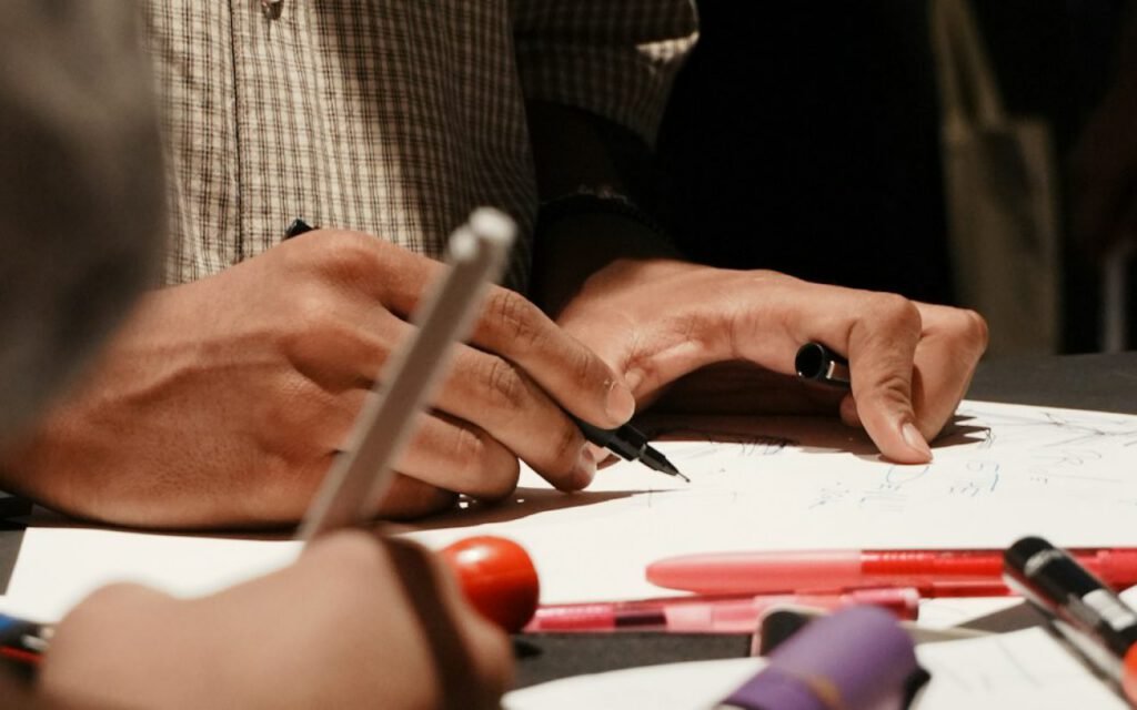
- Day two: I pick the eight strongest and redraw them larger with a black brush pen. This is where the squint test and the tab-icon test happen.
- Day three: The final three are rebuilt as clean vectors, still in pure black, and placed on simple real-world mockups: a paper cup, a sticker, a phone home screen.
The client sees three strong silhouettes in black, each shown at large and tiny sizes. When they pick one, the shape is already proven. We don’t waste rounds arguing about whether teal or navy feels more trustworthy while the actual mark is still wobbly.
What clients say once they see it
A few months ago I designed a mark for a small bike repair shop in Portland, Oregon. The owner told me later that seeing the logo in black first was what convinced him. He could picture it spray-painted on his van, burned into a wooden sign and printed on a cheap receipt, all before he had picked a single color. That kind of confidence is exactly what I want a client to feel before we touch the palette.
Color is a conversation
Once the shape works, we pick color together — usually two, never five. By this point, the conversation is easy, because the client already loves the mark. We are not trying to rescue a weak idea with color. We are choosing clothes for a design that already stands up on its own.
I usually bring three palette options, each with one main color and one supporting color. We talk about where the brand will live: storefront signs, Instagram, invoices, packaging, uniforms. A bakery that sells mostly through farmers markets needs colors that look warm on kraft paper. A dental office needs colors that feel calm on a white wall and still print well on appointment cards.
Two colors is plenty for almost every small business I work with. Five colors look exciting in a presentation and then become a headache the first time someone orders a banner, a T-shirt run or a new sign. Every extra color adds cost, adds room for printing mistakes and makes the brand harder to recognize.

The black version never goes away
Even after we choose the palette, every brand package I deliver includes the solid black version and a solid white version of the logo. Those are the files clients end up using most, often without realizing it: on receipts, on a sponsor banner at a Little League game, on a laser-engraved cutting board, on a local newspaper ad. The black mark is not a draft. It is the foundation the whole brand stands on.
Key takeaway: if your logo only looks good in color, it is not finished yet. Test it as a one-color stamp before you spend a dollar on printing.
Try it on your own logo
You don’t need to be a designer to run my black-first test on a logo you already have. Open the file, turn the whole thing solid black and look at it at three sizes: full page, business card and the size of a phone icon. Then print it on a cheap office printer and tape it to a wall across the room.
If it still reads clearly, congratulations. You have a strong mark, and color is just a pleasant bonus. If it falls apart, that is useful information too. It may only need a small fix, like thicker lines or fewer details, rather than a total redesign.
I keep coming back to the same idea with every new order. A logo has to work on the worst day of its life: faded on a sun-bleached sign, stitched on a cap, squeezed into a corner of a phone screen. Black prepares it for that day. Color is what we add once we know it can handle anything.
Sharing this with my friends.
Saved this one for later. Really useful.